はじめに
三角や矢印を作るCSSを簡単にコピペで使えるよう、向きごとのコードを一覧にしています。
実現方法について
透明にする
transparent(トランスペアレント)を使って要素を透明にする事で簡単に実現できます。
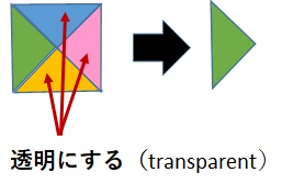
transparentは、設定されている背景色を無効にしたい場合にも使います。
background-color: transparent;
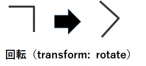
回転させる
transform: rotate を使って回転させます。
三角を作るCSS
HTMLサンプル
<div class=”up01“></div>
それぞれの向きに設定するクラス名の<div>タグで。
CSSサンプル
|
サンプル |
コード |
| 上 |
|
コードを表示
.up01{
width: 0;
height: 0;
border-left: 30px solid transparent;
border-right: 30px solid transparent;
border-bottom: 30px solid #ff3e9e ;
}
|
| 右上 |
|
コードを表示
.right_up{
width: 0;
height: 0;
border-style: solid;
border-width: 0 40px 40px 0;
border-color: transparent #ff3e9e transparent transparent;
}
|
| 右 |
|
コードを表示
.right01{
width: 0;
height: 0;
border-left: 30px solid #ff3e9e;
border-top: 30px solid transparent;
border-bottom: 30px solid transparent;
}
|
| 右下 |
|
コードを表示
.right_down{
width: 0;
height: 0;
border-style: solid;
border-width: 0 0 40px 40px;
border-color: transparent transparent #ff3e9e transparent;
}
|
| 下 |
|
コードを表示
.down01{
width: 0;
height: 0;
border-left: 30px solid transparent;
border-right: 30px solid transparent;
border-top: 30px solid #ff3e9e;
}
|
| 左下 |
|
コードを表示
.left_down{
width: 0;
height: 0;
border-style: solid;
border-width: 40px 0 0 40px;
border-color: transparent transparent transparent #ff3e9e;
}
|
| 左 |
|
コードを表示
.left01{
width: 0;
height: 0;
border-top: 30px solid transparent;
border-right: 30px solid #ff3e9e;
border-bottom: 30px solid transparent;
}
|
| 左上 |
|
コードを表示
.left_up{
width: 0;
height: 0;
border-style: solid;
border-width: 40px 40px 0 0;
border-color: #ff3e9e transparent transparent transparent;
}
|
応用サンプル
CSSサンプル
| サンプル |
コード |
|
|
コードを表示
.sample1 {
  border: 20px solid;
  border-color: #ff9eff #ffce9e #9e9eff #9effff;
  height: 100px;
  width: 100px;
  margin: 1rem auto;
}
|
|
|
コードを表示
.sample2 {
  border: 50px solid;
  border-color: #ff9eff #ffce9e #9e9eff #9effff;
  height: 0px;
  width: 0px;
  margin: 1rem auto;
}
|
|
見出しなどに
|
コードを表示
.sample3 {
  padding: 1rem 3rem;
  -webkit-transform: skew(-15deg);
  transform: skew(-15deg);
  color: #fff;
  position: relative;
  display: inline-block;
  height: 50px;
  font-size:20px;
  color: #fff;
  background: #ff3e9e;
}
|
|
リボン風
|
コードを表示
.sample4 {
  line-height: 60px;
  position: relative;
  height: 60px;
  margin: 2em 40px 1em;
  padding: 0 2rem;
  text-align: center;
  font-size:20px;
  color: #fff;
  background: #ff3e9e;
}
.sample4:before,.sample4:after {
  position: absolute;
  top: 0;
  display: block;
  height: 50px;
  content: '';
  border: 30px solid #ff3e9e;
}
.sample4:before {
  left: -40px;
  border-left-width: 15px;
  border-left-color: transparent;
}
.sample4:after {
  right: -40px;
  border-right-width: 15px;
  border-right-color: transparent;
}
|
|
吹き出し風
|
コードを表示
.sample5 {
  position: relative;
  padding: 1.5rem 2rem;
  font-size:20px;
  color: #fff;
  border-radius: 10px;
  background: #ff3e9e;
}
.sample5:after {
  position: absolute;
  bottom: -9px;
  left: 1em;
  width: 0;
  height: 0;
  content: '';
  border-width: 10px 10px 0 10px;
  border-style: solid;
  border-color: #ff3e9e transparent transparent transparent;
}
|
矢印を作るCSS
HTMLサンプル
<div class=”up02“></div>
それぞれの向きに設定するクラス名の<div>タグで。
CSSサンプル
|
サンプル |
コード |
| 上 |
|
コードを表示
.up02{
width: 30px;
height: 30px;
border: 5px solid;
border-color: #555 #555 transparent transparent;
transform: rotate(-45deg);
}
|
| 右 |
|
コードを表示
.right02{
width: 30px;
height: 30px;
border: 5px solid;
border-color: #555 #555 transparent transparent;
transform: rotate(45deg);
}
|
| 左 |
|
コードを表示
.left02{
width: 30px;
height: 30px;
border: 5px solid;
border-color:  transparent transparent #555 #555;
transform: rotate(45deg);
}
|
| 下 |
|
コードを表示
.down02{
width: 30px;
height: 30px;
border: 5px solid;
border-color:  transparent transparent #555 #555;
transform: rotate(-45deg);
}
|


コメント